Grey No More


I'm not a colourist. I've always leaned toward greys, muted tones, raw surfaces. But when I started working on these coasters, I decided to do something different. It was meant to be an experiment – shape, texture… and then colour. And that moment turned out to be key.
Even though I’ve known for a long time that colour can completely change how a project feels, it wasn’t until I really started using it that I saw it happen. Each coaster turned out differently – not just in shade, but in mood and character. Some are calm, others bold. Some catch the eye, others blend in quietly.
I began to realise that colour doesn’t just complete a piece – sometimes it leads it. It adds meaning, triggers a response, makes something feel like it belongs to someone. It fits their space, their energy, their expectations.
And while I still love my greys as a base, I now know it’s worth stepping out of them sometimes. For contrast. For story. For all the things that only begin once colour comes in.
Here’s the tutorial for making coasters with this texture.

For a black version with subtle shine – follow the tutorial below.

Feeling like playing with glass paints a bit more? Here’s a pomegranate-inspired one!

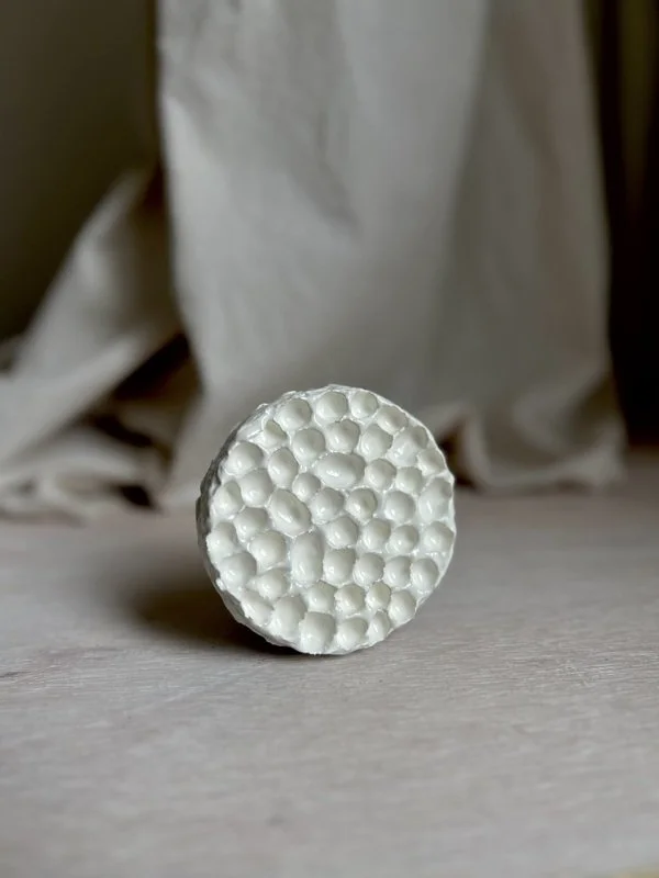
If you’d like to get a porcelain-like effect on your coaster – or just play around with fake porcelain – check out the post below.
White coaster with gold details
This one's painted with white acrylic paint and finished with gold leaf.
I used regular PVA glue (slightly thinned with water), waited until it wasn’t too tacky, and gently pressed the gold pieces on.
I’ll try to post a short tutorial soon!

Into the Blue
This one’s a mix of deep blues and turquoise, with touches of gold.
I also used a bit of glass paint here and there to add some subtle shine.

Sunset Pop
This one started with a full coat of violet.
Then I painted the raised areas with shades of pink, red and orange – just letting the colours play together.
